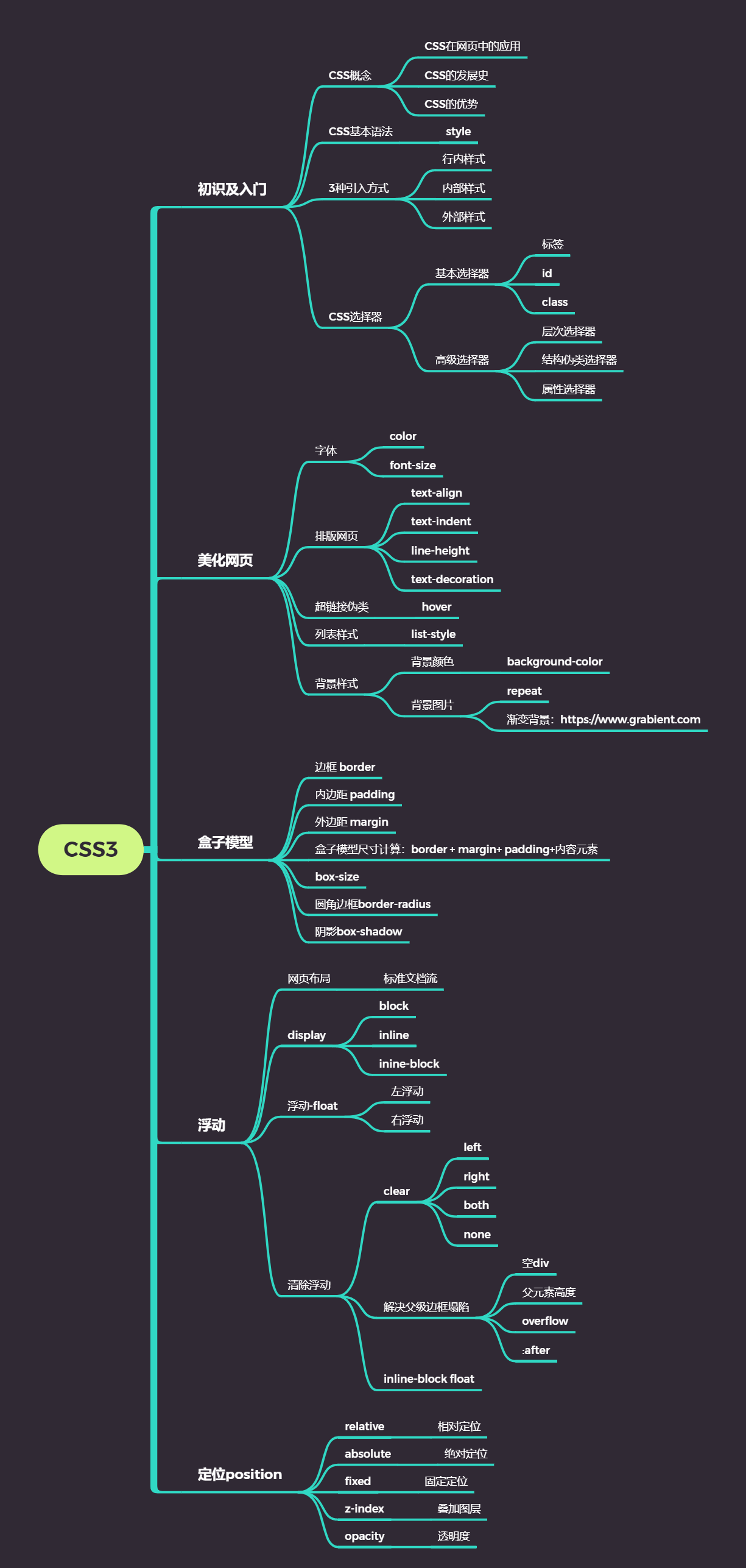
CSS3学习
1.css是什么
2.CSS怎么用(快速入门)
3.CSS选择器(重点 + 难点)
4.美化页面(文字、阴影、超链接、列表、渐变…)
5.盒子模型
6.浮动
7.定位
8.网页动画(特效)->菜鸟教程->w3cschool
1.什么是CSS
1.1、什么是CSS
Cascading Style Sheet 层叠样式表
CSS:表现(美化网页)
字体,颜色,边距,高度,宽度,背景图片,网页定位,网页浮动
1.2、发展史
CSS1.0
CSS2.0:DIV(块)+CSS,HTML与CSS结构分离的思想,网页变得简单,SEO
CSS2.1:浮动,定位
CSS3.0:圆角、阴影、动画…浏览器兼容性~
2、快速入门
2.1.1、练习格式:
1
2
3
4
5
6
7
8
9
10
11
12
13
14
15
16
17
18
19
20
21
22
23
24
| <!DOCTYPE html>
<html lang="en">
<head>
<meta charset="UTF-8">
<title>Title</title>
<style>
h1{
color: crimson;
}
</style>
</head>
<body>
<h1>CSS测试</h1>
</body>
</html>
1234567891011121314151617181920212223
|
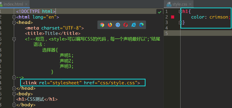
建议使用这种规范(单独写一个css文件,用link标签引入css文件效果):
2.1.2、CSS的优势:
1、内容和表现分离;
2、网页结构表现统一,可以实现复用
3、样式十分的丰富
4、建议使用独立于html的css文件
5、利用SEO,容易被搜索引擎收录!
2.1.3、CSS的3种常用导入方式
1
2
3
4
5
6
7
8
9
10
11
12
13
14
15
16
17
18
19
20
21
22
| <!DOCTYPE html>
<html lang="en">
<head>
<meta charset="UTF-8">
<title>Title</title>
<style>
h1{
color: green;
}
</style>
<link rel="stylesheet" href="css/style.css" />
</head>
<body>
<h1 style="color: red">这是标签</h1>
</body>
</html>
|
拓展:外部样式两种方法
1
2
|
<link rel="stylesheet" href="css/style.css" />
|
- 导入式
@import是CSS2.1特有的!(弊端:可能展示网页的时候,先是一个骨架,然后加载完之后再变得好)
1
2
3
4
|
<style>
@import url("css/style.css");
</style>
|
2.2选择器
作用:选择页面上的某一个或者某一类元素
2.2.1、基本选择器
1、标签选择器
选择一类标签
格式: 标签 { }
1
2
3
4
5
6
7
8
9
10
11
12
13
14
15
16
17
18
19
20
21
22
23
24
| <head>
<meta charset="UTF-8">
<title>Title</title>
<style>
h1{
color: orange;
background: blue;
border-radius: 10px;
}
h3{
color: orange;
background: blue;
border-radius: 10px;
}
p{
font-size: 80px;
}
</style>
</head>
<body>
<h1>标签选择器</h1>
<p>我爱学习</p>
<h3>学习JAVA</h3>
</body>
|
2、类选择器class
选择所有class一致的标签,跨标签
格式: .类名{}
1
2
3
4
5
6
7
8
9
10
11
12
13
14
15
16
17
18
19
20
21
22
23
| <head>
<meta charset="UTF-8">
<title>Title</title>
<style>
/*类选择器的格式 .class的名称{}
好处:可以多个标签归类,是同一个class,可以复用*/
.demo1{
color: blue;
}
.demo2{
color: red;
}
.demo3{
color: aqua;
}
</style>
</head>
<body>
<h1 class = "demo1">类选择器:demo1</h1>
<h1 class="demo2">类选择器:demo2</h1>
<h1 class="demo3">类选择器:demo3</h1>
<p class="demo3">p标签</p>
</body>
|
3、id 选择器
全局唯一
格式: #id名{}
1
2
3
4
5
6
7
8
9
10
11
12
13
14
15
16
17
18
19
20
21
22
23
24
25
26
27
28
29
30
| <head>
<meta charset="UTF-8">
<title>Title</title>
<style>
/*id选择器:id必须保证全局唯一
#id名称{}
不遵循就近原则,优先级是固定的
id选择器 > class类选择器 > 标签选择器
*/
#demo1{
color: red;
}
.demo2{
color: green;
}
#demo2{
color: orange;
}
h1{
color: blue;
}
</style>
</head>
<body>
<h1 id="demo1" class="demo2">id选择器:demo1</h1>
<h1 class="demo2" id = "demo2">id选择器:demo2</h1>
<h1 class="demo2">id选择器:demo3</h1>
<h1 >id选择器:demo4</h1>
<h1>id选择器:demo5</h1>
</body>
|
优先级:id > class > 标签
2.2.2、高级选择器
1. 层次选择器
1
2
3
4
5
6
|
<style>
body p{
background:red;
}
</style>
|
1
2
3
4
5
6
|
<style>
body>p{
background:orange;
}
</style>
|
- 相邻的兄弟选择器 同辈(弟弟选择器–>所选的下一个!)
1
2
3
4
5
6
7
8
9
10
|
<style>
.active+p{
background: red
}
</style>
<body>
<p class="active">p1<p>
<p>p2</p>
</body>
|
- 通用选择器(哥哥弟弟选择器–>所选和所选的下一个!)
1
2
3
4
5
6
7
8
9
10
| <style>
.active~p{
background:red;
}
</style>
<body>
<p class="active">p1<p>
<p>p2</p>
</body>
|
2.结构伪类选择器
伪类
1
2
3
4
5
6
7
8
9
10
11
12
13
14
15
16
17
18
19
20
21
22
23
24
25
26
27
28
29
30
31
32
33
34
35
36
37
38
| <style>
ul li:first-child{
background: aqua;
}
ul li:last-child{
background: blue;
}
p:nth-child(1){
background: orange;
}
p:nth-of-type(2){
background: red;
}
a:hover{
color: green;
}
</style>
</head>
<body>
<a href="">123</a>
<p>p1</p>
<p>p2</p>
<p>p3</p>
<h3>h3</h3>
<ul>
<li>1li1</li>
<li>1li2</li>
<li>1li3</li>
</ul>
<ul>
<li>2li1</li>
<li>2li2</li>
<li>2li3</li>
</ul>
<a href="www.baidu.com">百度</a>
</body>
|
3.属性选择器(常用)
id + class结合
1
2
3
4
5
6
7
8
9
10
11
12
13
14
15
16
17
18
19
20
21
22
23
24
25
26
27
28
29
30
31
32
33
34
35
36
37
38
39
40
41
42
43
44
45
46
47
48
49
50
51
52
53
54
55
56
57
58
59
| <head>
<meta charset="UTF-8">
<title>Title</title>
<style>
.demo a{
float: left;
display: block;
height: 50px;
width: 50px;
border-radius: 10px;
background: aquamarine;
text-align: center;
color: gray;
text-decoration: none;
margin-right: 5px;
font: bold 20px/50px Arial;
}
/*属性名,属性名=属性值(正则)
= 表示绝对等于
*= 表示包含
^= 表示以...开头
$= 表示以...结尾
存在id属性的元素
a[]{}
*/
a[id]{
background: yellow;
}
a[id=first]{
background: green;
}
a[class*="links"]{
background: bisque;
}
a[href^=http]{
background: aquamarine;
}
a[href$=pdf]{
background: aquamarine;
}
</style>
</head>
<body>
<p class="demo">
<a href="http:www.baidu.com" class="links item first" id="first">1</a>
<a href="" class="links item active" target="_blank " title="test">2</a>
<a href="images/123.html" class="links item">3</a>
<a href="images/1.png" class="links item">4</a>
<a href="images/1.jpg" class="links item">5</a>
<a href="abc" class="links item">6</a>
<a href="/a.pdf" class="links item">7</a>
<a href="/abc.pdf" class="links item">8</a>
<a href="abc.doc" class="links item">9</a>
<a href="abcd.doc" class="links item last">10</a>
</p>
</body>
|
效果:
3、美化网页元素
3.1、为什么要美化网页
- 有效的传递页面信息
- 美化网页,页面漂亮才能吸引客户
- 凸显页面的主题
- 提高用户的体验
span标签:重点要突出的字,使用span标签套起来
1
2
3
4
5
6
7
8
9
10
11
12
| <head>
<meta charset="UTF-8">
<title>Title</title>
<style>
#title1{
font-size: 50px;
}
</style>
</head>
<body>
学习语言<span id="title1">JAVA</span>
</body>
|
3.2、字体样式
- font-family:字体
- font-size:字体大小
- font-weight:字体粗细
- color:字体颜色
1
2
3
4
5
6
7
8
9
10
11
12
13
14
15
16
17
18
19
20
21
22
23
| <head>
<meta charset="UTF-8">
<title>Title</title>
<style>
body{
font-family:"Arial Black",楷体;
color: red;
}
h1{
font-size: 50px;
}
.p1{
font-weight: 600px;
color: gray;
}
</style>
</head>
<body>
<h1>标题</h1>
<p>正文11111</p>
<p class="p1">正文2222222</p>
<p>i love study java</p>
</body>
|
常用写法:
1
2
3
| font-weight:bolder;
font:oblique bloder 12px "楷体"
|
3.3、文本样式
- 颜色–>color:agb / rgba()
- 文本对齐方式–>text-align:center
- 首行缩进–>text-indent:2em
- 行高–>line-height:300px;
- 下划线–>text-decoration
1
2
3
4
| text-decoration:underline/*下划线*/
text-decoration:line-through/*中划线*/
text-decoration:overline/*上划线*/
text-decoration:none/*超链接去下划线*/
|
- 图片、文字水平对齐
1
| img,span{vetical-align:middle}
|
3.4、超链接伪类
1
2
3
4
5
6
7
8
9
10
11
12
13
14
15
16
17
18
| <style>
a{
text-decoration:none;
color:#000000;
}
a:hover{
color:orange;
}
a:active{
color:green
}
a:visited{
color:red
}
a:link{
background: bisque;
}
</style>
|
3.5文本阴影:
1
2
3
4
5
6
|
text-shadow:5px 5px 5px 颜色
|
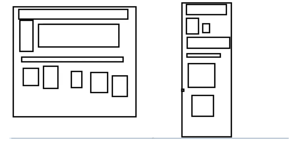
3.6、列表ul li
主页index.html代码:
1
2
3
4
5
6
7
8
9
10
11
12
13
14
15
16
17
18
19
20
21
22
23
24
25
26
27
28
29
30
31
32
33
34
35
36
37
38
39
40
41
42
43
44
45
46
47
48
49
50
51
52
53
| <!DOCTYPE html>
<html lang="en">
<head>
<meta charset="UTF-8">
<title>Title</title>
<link href="css/style.css" rel="stylesheet" type="text/css">
</head>
<body>
<div id="nav">
<h2 class="title">全部商品分类</h2>
<ul>
<li>
<a href="#">图书</a>
<a href="#">音像</a>
<a href="#">数字商品</a>
</li>
<li>
<a href="#">家用电器</a>
<a href="#">手机</a>
<a href="#">数码</a>
</li>
<li>
<a href="#">电脑</a>
<a href="#">办公</a>
</li>
<li>
<a href="#">家居</a>
<a href="#">家装</a>
<a href="#">厨具</a>
</li>
<li>
<a href="#">服饰鞋帽</a>
<a href="#">个性化妆</a>
</li>
<li>
<a href="#">礼品箱包</a>
<a href="#">钟表</a>
<a href="#">珠宝</a>
</li>
<li>
<a href="#">食品饮料</a>
<a href="#">保健食品</a>
</li>
<li>
<a href="#">彩票</a>
<a href="#">旅行</a>
<a href="#">充值</a>
<a href="#">票务</a>
</li>
</ul>
</div>
</body>
</html>
|
css代码:
1
2
3
4
5
6
7
8
9
10
11
12
13
14
15
16
17
18
19
20
21
22
23
24
25
26
27
28
29
30
31
32
33
34
35
36
| #nav{
width: 300px;
background: antiquewhite;
}
.title{
font-size: 18px;
font-weight: bold;
text-indent: 1em;
line-height: 35px;
background: red;
}
ul li{
height: 30px;
list-style: none;
text-indent: 1em;
}
a{
text-decoration: none;
font-size: 14px;
color: black;
}
a:hover{
color: burlywood;
text-decoration: underline;
}
|
3.7、背景
- 背景颜色:background
- 背景图片
1
2
3
4
| background-image:url("");
background-repeat:repeat-x/*水平平铺*/
background-repeat:repeat-y/*垂直平铺*/
background-repeat:no-repeat/*不平铺*/
|
3.8、渐变
渐变背景网址:https://www.grabient.com
径向渐变、圆形渐变
1
2
3
4
| body{
background-color: #4158D0;
background-image: linear-gradient(43deg, #4158D0 0%, #C850C0 46%, #FFCC70 100%);
}
|
4、盒子模型
4.1什么是盒子模型
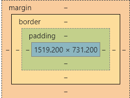
- margin:外边距
- padding:内边距
- border:边框
4.2、边框
border:粗细 样式 颜色
- 边框的粗细
- 边框的样式
- 边框的颜色
4.3、外边距—-妙用:居中
margin-left/right/top/bottom–>表示四边,可分别设置,也可以同时设置如下
1
2
3
4
5
6
7
| margin:0 0 0 0/*分别表示上、右、下、左;从上开始顺时针*/
/*例1:居中*/
margin:0 auto /*auto表示左右自动*/
/*例2:*/
margin:4px/*表示上、右、下、左都为4px*/
/*例3*/
margin:10px 20px 30px/*表示上为10px,左右为20px,下为30px*/
|
盒子的计算方式:
margin+border+padding+内容的大小
总结:
body总有一个默认的外边距 margin:0
常见操作:初始化
4.4、圆角边框—-border-radius
1
2
3
4
5
6
7
8
9
| <style>
div{
width: 100px;
height: 100px;
border: 10px solid red;
border-radius: 50px 20px 20px 30px;
}
</style>
|
4.5、盒子阴影
1
| box-shadow: 10px 10px 1px black;
|
5、浮动
5.1标准文档流
块级元素:独占一行 h1~h6 、p、div、 列表…
行内 元素:不独占一行 span、a、img、strong
注: 行内元素可以包含在块级元素中,反之则不可以
5.2、display(重要)
- block:块元素
- inline:行内元素
- inline-block:是块元素,但是可以内联,在一行
这也是一种实现行内元素排列的方式,但是我们很多情况用float
- none:消失
1
2
3
4
5
6
7
8
9
10
11
12
13
14
15
16
17
18
19
20
21
22
23
24
25
26
27
28
29
| <!DOCTYPE html>
<html lang="en">
<head>
<meta charset="UTF-8">
<title>Title</title>
<style>
div{
width: 100px;
height: 100px;
border: 1px solid red;
display: inline-block;
}
span{
width: 100px;
height: 100px;
border: 1px solid red;
display: inline-block;
}
</style>
</head>
<body>
<div>div块元素</div>
<span>span行内元素</span>
</body>
</html>
|
5.3、float:left/right左右浮动
clear:both
5.4、overflow及父级边框塌陷问题
clear:
right:右侧不允许有浮动元素
left:左侧不允许有浮动元素
both:两侧不允许有浮动元素
none:
解决塌陷问题方案:
方案一:增加父级元素的高度;
方案二:增加一个空的div标签,清除浮动
1
2
3
4
5
6
7
8
| <div class = "clear"></div>
<style>
.clear{
clear:both;
margin:0;
padding:0;
}
</style>
|
方案三:在父级元素中增加一个overflow属性
1
2
| overflow:hidden/*隐藏超出部分*/
overflow:scoll/*滚动*/
|
方案四:父类添加一个伪类:after
1
2
3
4
5
| #father:after{
content:'';
display:block;
clear:both;
}
|
小结:
- 浮动元素增加空div—-> 简单、代码尽量避免空div
- 设置父元素的高度—–> 简单,但是元素假设有了固定的高度,可能就会超出范围
- overflow—-> 简单,下拉的一些场景避免使用
- 父类添加一个伪类:after(推荐)—-> 写法稍微复杂,但是没有副作用,推荐使用
5.5、display与float对比
- display:方向不可以控制
- float:浮动起来的话会脱离标准文档流,所以要解决父级边框塌陷的问题。
6、定位
6.1、相对定位
相对定位:positon:relative;
相对于原来的位置,进行指定的偏移,相对定位的话,它仍然在标准文档流中!原来的位置会被保留
1
2
3
4
| top:-20px;
left:20px;
bottom:10px;
right:20px;
|
代码:
1
2
3
4
5
6
7
8
9
10
11
12
13
14
15
16
17
18
19
20
21
22
23
24
25
26
27
28
29
30
31
32
33
34
35
36
37
38
39
40
41
42
43
44
45
46
47
48
49
| <!DOCTYPE html>
<html lang="en">
<head>
<meta charset="UTF-8">
<title>相对定位</title>
<style>
body{
padding: 20px;
}
div{
margin: 10px;
padding: 5px;
font-size: 12px;
line-height: 25px;
}
#father{
border: #ffa538 1px solid;
padding: 0;
}
#first{
border: #b3ff38 1px solid;
background-color: #ffa538;
position: relative;
top: -20px;
left: 20px;
}
#second{
border: #427b11 1px solid;
background-color: #66c77f;
}
#third{
background-color: #b3ff38;
border: #38d7ff 1px solid;
position: relative;
bottom: 10px;
}
</style>
</head>
<body>
<div id="father">
<div id="first">第一个盒子</div>
<div id="second">第二个盒子</div>
<div id="third">第三个盒子</div>
</div>
</body>
</html>
|
练习: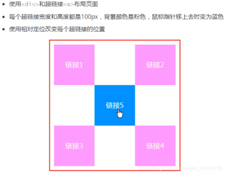
实现代码:
1
2
3
4
5
6
7
8
9
10
11
12
13
14
15
16
17
18
19
20
21
22
23
24
25
26
27
28
29
30
31
32
33
34
35
36
37
38
39
40
41
42
43
44
45
46
| <style>
#box{
height: 300px;
width: 300px;
border: 2px red solid;
padding: 10px;
}
a{
height: 100px;
width: 100px;
background-color: #ee73b7;
color: white;
text-align: center;
text-decoration: none;
line-height: 100px;
display: block;
}
a:hover{
background: #4158D0;
}
.a2{
position: relative;
left: 200px;
top: -100px;
}
.a4{
position: relative;
left: 200px;
top: -100px;
}
.a5{
position: relative;
left: 100px;
top: -300px;
}
</style>
</head>
<body>
<div id="box">
<div class="a1"><a href="" >连接1</a></div>
<div class="a2"><a href="" >连接2</a></div>
<div class="a3"><a href="" >连接3</a></div>
<div class="a4"><a href="" >连接4</a></div>
<div class="a5"><a href="" >连接5</a></div>
</div>
</body>
|
6.2、绝对定位-absolute和固定定位-fixed
定位:基于xxx定位,上下左右~
1、没有父级元素定位的前提下,相对于浏览器定位
2、假设父级元素存在定位,我们通常会相对于父级元素进行偏移
3、在父级元素范围内移动
总结:相对一父级或浏览器的位置,进行指定的偏移,绝对定位的话,它不在标准文档流中,原来的位置不会被保留
1
2
3
4
5
6
7
8
9
10
11
12
13
14
15
16
17
18
19
20
21
22
23
24
25
26
27
28
29
| <head>
<meta charset="UTF-8">
<title>Title</title>
<style>
body{
height: 1000px;
}
div:nth-of-type(1){
width: 100px;
height: 100px;
background-color: red;
position: absolute;
right: 0;
bottom: 0;
}
div:nth-of-type(2){
width: 50px;
height: 50px;
background-color: #b3ff38;
position: fixed;
right: 0;
bottom: 0;
}
</style>
</head>
<body>
<div>div1</div>
<div>div2</div>
</body>
|
6.3、z-index
图层-z-index:默认是0,最高无限~999
index.html代码:
1
2
3
4
5
6
7
8
9
10
11
12
13
14
15
16
17
18
19
20
| <!DOCTYPE html>
<html lang="en">
<head>
<meta charset="UTF-8">
<title>Title</title>
<link rel="stylesheet" href="css/style.css" type="text/css">
<style></style>
</head>
<body>
<div id="content">
<ul>
<li><img src="images/2020.jpg" alt=""/></li>
<li class="tipText">学习微服务,找狂神</li>
<li class="tipBg"></li>
<li>时间:2099-01-01</li>
<li>地点:月球一号基地</li>
</ul>
</div>
</body>
</html>
|
css代码:
1
2
3
4
5
6
7
8
9
10
11
12
13
14
15
16
17
18
19
20
21
22
23
24
25
26
27
28
29
30
31
32
33
| #content{
width: 380px;
padding: 0px;
margin: 0px;
overflow: hidden;
font-size: 12px;
line-height: 25px;
border: 1px solid yellow;
}
ul,li{
padding: 0px;
margin: 0px;
list-style: none;
}
#content ul{
position: relative;
}
.tipText,.tipBg{
position: absolute;
width: 380px;
height: 25px;
top:216px
}
.tipText{
color: white;
z-index: 999;
}
.tipBg{
background: orange;
opacity: 0.5;
filter: alpha(opacity=50);
}
|
7、动画及视野拓展
css做动画过于繁琐,已有很多工具间接性做出
百度搜索canvas动画、卡巴斯基监控站(仅作了解)
8、总结
 微信
微信 支付宝
支付宝